Animal Captain is now available in App Stores all over the world! We initially soft launched the game in Scandinavia to get an idea of how the game would be received – and to see if there were any major bugs in the game. Everything looks fine and Scandinavia is happy with our game. So we’re crossing our fingers, hoping the rest of the world will welcome our game too!
All posts filed under “Uncategorized”
Drawing Animals
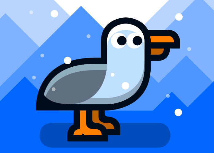
The super minimalistic graphics used in Animal captain might seem fairly easy to produce at first glance. But a simple design solution doesn’t necessarily make one’s work any easier. When going minimalistic, you leave it up to just a few lines to give the necessary information, to tell the story and to display emotion. What you cut away are all the effects – the smokes and mirrors that makes the game look tasty and shiny. In short – the more you simplify, the more important every line gets.
All the graphics in Animal Captain follow a strict underlying grid. This gives the game a very consistent look which is easy to recognize. Sadly, this approach also limits our graphic possibilities. It’s impossible to draw very small objects, like an ant or a bee, because it’s simply too small to be drawn within a grid.
Some animals fit better in a grid than others. Animals like the elephant, the cow and the dog have been fairly easy to draw, since they can be created using simple shapes. Other animals, like the snake, the rhino and the squirrel took forever to draw, because they have a few curves which somehow just doesn’t fit inside the grid.
The Captain
Why is there a captain in the game? If you think about it, he doesn’t really add anything to the gameplay, and the game would still make 100% sense if we removed him.
But there’s a good reason he’s there. During the initial design phase, we realised that we needed to give the players some feedback on their actions. We needed to tell the players when they did something right and when they did something wrong. We knew we couldn’t use written messages, since our players are toddlers and therefore unable to read. Using sound to give feedback wasn’t an option either, since the sound may be turned off.
The solution was to include the captain – who gives the player feedback through a series of simple gestures. We chose to limit the gesture palette to four states: Default, happy, worried and refusing. We added a fifth state just for fun: Sleeping. Which is activated when the player doesn’t touch the screen for a while.
Italic Logo
Italic is the name of our games company. The basic idea for the logo was to make it both masculine and feminine at the same time, and I therefore I to incorporate both hard and soft elements. I basically tried to make a mix of the elegant and feminine Chanel logo and Märklin‘s masculine functionalist logo.
When working with the logo, I realized that I would need to use the logo in a number of different scenarios. It has to look good on a black, white or coloured background, on a business card and on a tablet screen. I may want to make a horror game one day. Or a Barbie game. And the logo has to look as if it is a natural part of both worlds. I therefore focused on making a very flexible logo that could be used in relation with a variety of products.
The final logo ended up being a symbol and a name – encapsulated by a circle. I could have chosen to leave out one of those elements – as for example the ‘I’-symbol or the surrounding circle, but having all the elements in the core logo allows me to divert from it in numerous ways. I can for example change the colour to black, change the surrounding circle to a different shape – or leave out the name if I need to. The logo will still remain recognizable. And having the option to deviate from the core logo gives me a much broader palette of design options.
Here’s a video which displays the numerous steps I went through when making the logo. I often see logos made by other people and wonder how much time was spent making them. You’d think a simple logo would take a few minutes, but as you may understand when watching the video it usually takes a lot of hours to make one.


